(And another London underground lines)
While in your daily commute, have you ever feel like climbing a mountain of people, as you try to get off the train and forgot that the “doors will open on the left-hand side”?
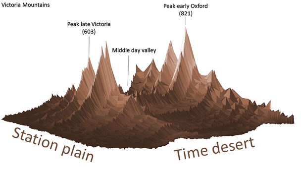
Although a corny metaphor, the above artistic-free version tries to capture precisely that feeling. Each peak in that “mountain range” represents the number of people that are in a particular station inside the Victoria Line* at each minute of a beautiful Monday. The higher the peak, the “higher” the number of people you will find at that station at that minute.
The idea was to follow the anonymized commuters in their journey through the line since the moment they enter a station A until they leave the network at a station B. In this way, the peaks are building up as more and more people come to station A and there’s no train waiting at the platform when they get there.
Methods
I’m using three sources of information:
1) Records from a large dataset of Oyster Card tap in’s and tap out’s across London’s public transport network for a typical Monday.
2) The official timetable for the Victoria Line so we can infer where in the system our commuter is, and
3) An interchanging time survey, which provides the average time that would take a regular person to get into the station platform from the station entrance.
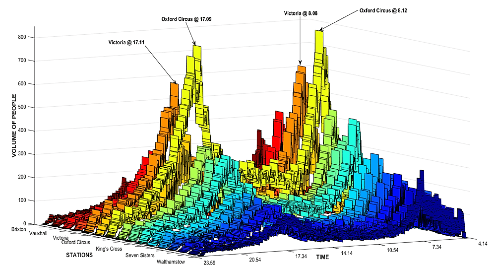
Only rides starting and ending on Victoria are counted to provide a strong indication of the exact route through the network, and I restricted the hours from 4.14 in the mornings to 23.59 late at night.
Sixteen 1185 point time series, representing the volume of people that are in a particular station A at a particular time t, were defined as follows:
Total volume of people = PTIN + PWP + PIT
Where
PTIN = People tapping in,
PWP = People walking to/leaving the platform
PIT = People on a train align at Si at ti
These time series show the number of people that the system holds at any given minute. As expected, the endpoint of the line is not particularly crowded in the sense that people do not have to wait for too much to board a train. For example, at Walthamstow Central, from 9.00am to 9.01am only 9 people entered the system. Then, between 9.02am and 9.03am, the count goes from 59 to 31. This means that a train arrived at 9.02am and the 59 people waiting to get on board, and, at 9.03am a new fresh set of 31 people arrived at the platform.
The highest peak is Oxford Circus, 08.12. At that time we can find 821-Victoria-line-related souls wandering around the station. This number is likely to be lower when compare it with reality. We’ll find out when the rest of the lines are taking into account.
In the end, no surprises here. The general behaviour was as expected, recovering the classic double peaks observed in urban transport dynamics, with Oxford and Victoria being the busiest stations through all day.
A final plot for the purist. The next ribbons show the same data without the mountain effect. Some may found it clearer.
Now, with all these info, we can get creative and try to assets the associated risk with crowdedness at each station at every minute. But that’s a different and more obscure story that involves our old friend Shannon and something call Transfer Entropy
You can read the whole analysis for the Victoria line here.
Special mention to @Ed Manley and Chen Zhong for all their help with this one.
More lines later…much later
