(In some UK retail areas at least)
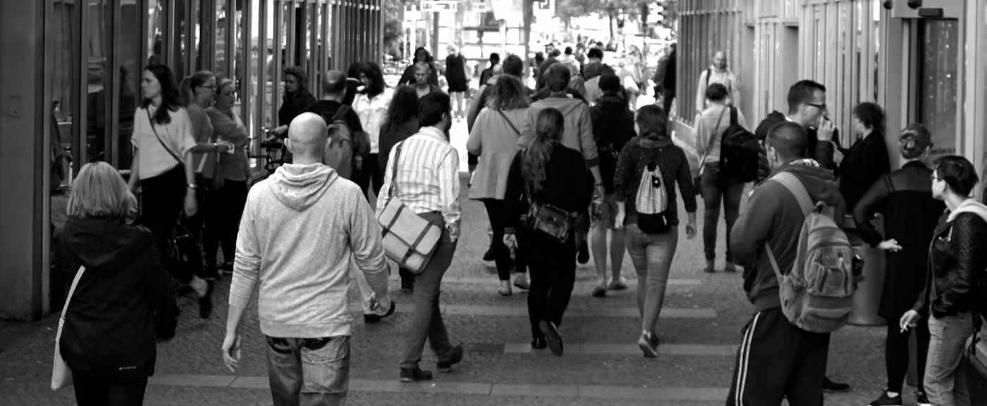
Cities are the epitome of diversity, right? Thousands of people going to thousands of places following different routes at different times. So why is that I cannot move an inch around Bond St. Tube station at 8.34 in the morning on a regular Tuesday? Why walking from Euston Rd to Goodge St along Tottenham Court Rd at 9.37am is an extreme sport? Although is true that we are individual beings with individual agendas, at some scale, for the majority of +18 urban dwellers, we all follow the same routine during weekdays: Wake up early, commute, get into our offices around 8am-10am, wander around lunchtime (12 pm), get out between 5-7pm, do “something” before heading home, commute, reach back, do something else (fun hopefully) and go to sleep. Repeat. Moreover, this works as a clock for Weekdays, Fridays being a bit different and Weekends following their rhythms.
There’s plenty of studies about these circadian rhythms ([1] [2] [3]) based primarily either on GPS traces, Call Detail Records and Location Based Social Networks. However, these datasets are hard to access an usually rely on very disclosing data (like the exact position of a person or its particular weekly routine from home to work). Recently, I got my hands on an amazing alternative way to measure the volume of people passing by specific locations every five minutes: the Consumer Data Research Centre’s SmartStreetSensors data. As explained there, “The dataset contains details of passive WiFi signal probing from a sensor network across Great Britain. These data are used as a proxy for estimating footfall at retail locations […] potentially identifiable information collected is hashed at sensor level, and the data is sent to the central server via an encrypted channel for storage”. The temporal resolution of this network is sufficiently granular to detect general patterns across a day without compromising some individual’s privacy. As the aim of these data is to measure Footfall (FF)- namely, the volume of people enter a store or a retail area- the data is biased towards those particular areas in cities. You won’t find any sensors at residential neighbourhoods for example.
In this brief blog, we want to show some of the benefits of these data, along with possible future lines of investigation. On purpose, we are leaving out the painful and tricky job to transform these signal probes into individual counts as this will be included in an oncoming arXiv entry.
The Footfall data
We analysed ~53 million records corresponding to all the aggregated 5-minutes FF counts during 2017 at 889 locations (~35 % of them in the Greater London area). The following map shows the spatial distribution of this network. The brightest areas correspond to cities with a higher number of sensors in operation (which does not necessarily implies a higher FF, although in the case of London it is the case)
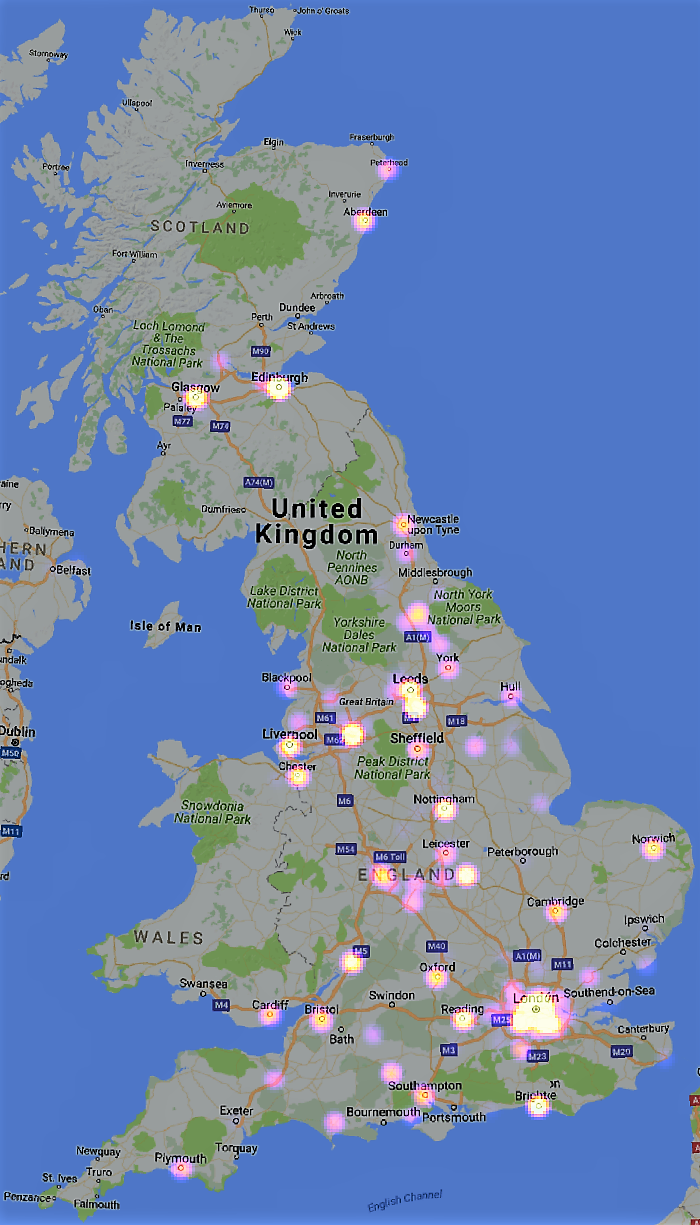
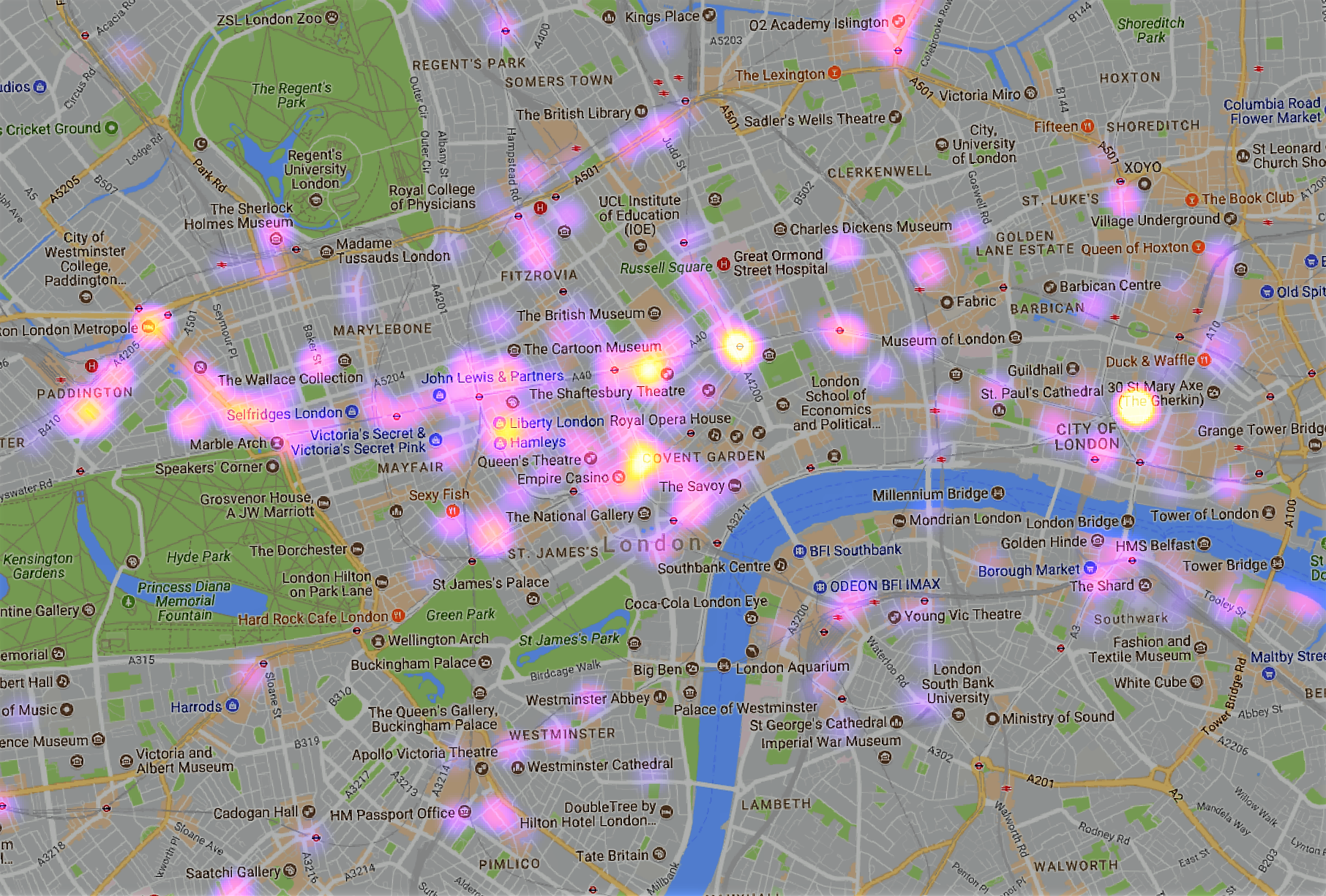
Zooming over central London, we can observe that denser patches of sensors are found around The City an London’s tourist ground zero area.
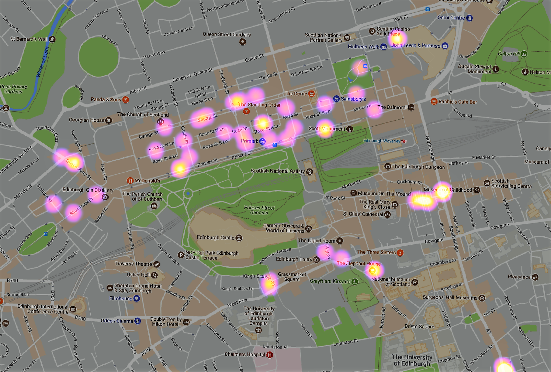
The same for Edinburgh central area where we can find a dense cloud of sensors between Princess St and George St
Regarding the volume of FF, the busiest location in 2017 was The Balcony, at Waterloo Station, London, with a peak on the 6th of December of 300,000; the one with less, Princes Dock Street, Hull, with a standard deviation of 129 and 43 respectively. In a year, the daily change in FF (weighted by the number of locations) in GB is quite stable, as the following Figure shows:
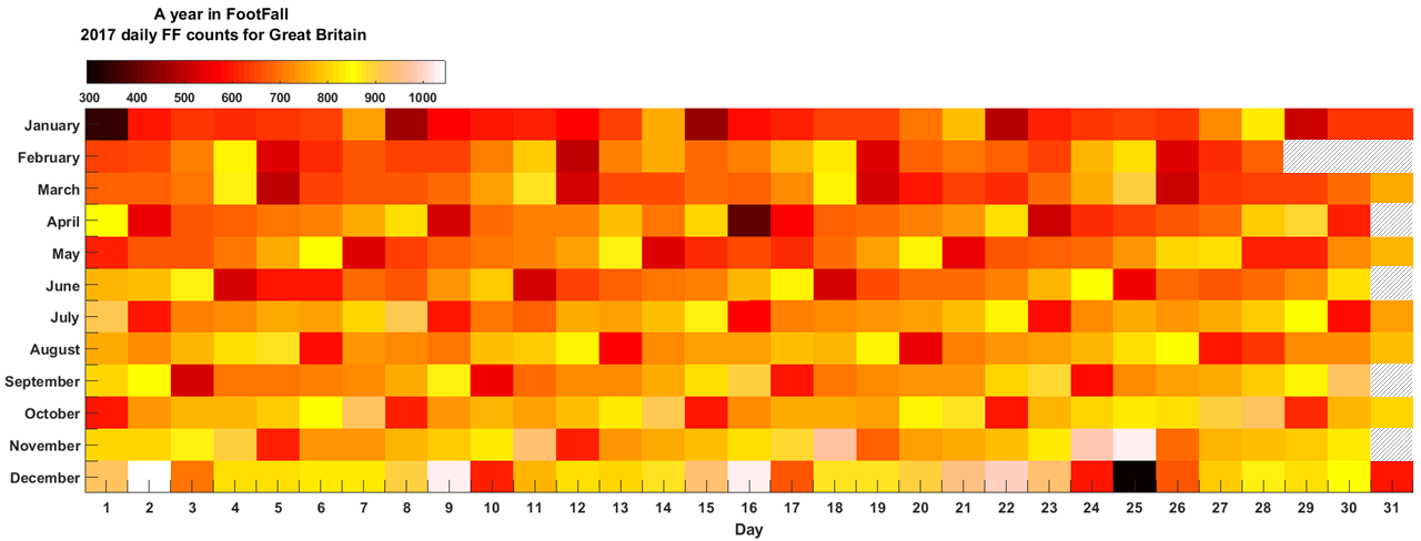
January the 1st and December 25th are the lowest point in FF (black squares), while the 3 Saturdays and Friday before Xmas are busy days in retail areas, as expected. January, February and March exhibit lower levels of FF than the rest of the year, reflecting the known fact that people tend to spend less time shopping at retail areas at the beginning of the year. The weekly rhythm of FF is also evident. The blocks between Monday-Sunday are evident at each Month, take for example October, where we can trace a week between red blocks (the first one was a Sunday), as see how each day of the week shares the similar tones of yellow, i.e., shares similar FF.
This plot was really promising as it recovers what you would expect around the different seasons of the year and the known differences between weekdays-weekends. The only “suspicious” day is Sunday, April the 16th, that exhibits an unusual low FF, someone knows why?
So let us now look at individual days to see if this data can detect local changes in pattern, due to, for example, extraordinary events.
Footfall Signals
Each location has a particular signal – FF counts as a function time – that inform us about the local movements of pedestrians around that area. For example:
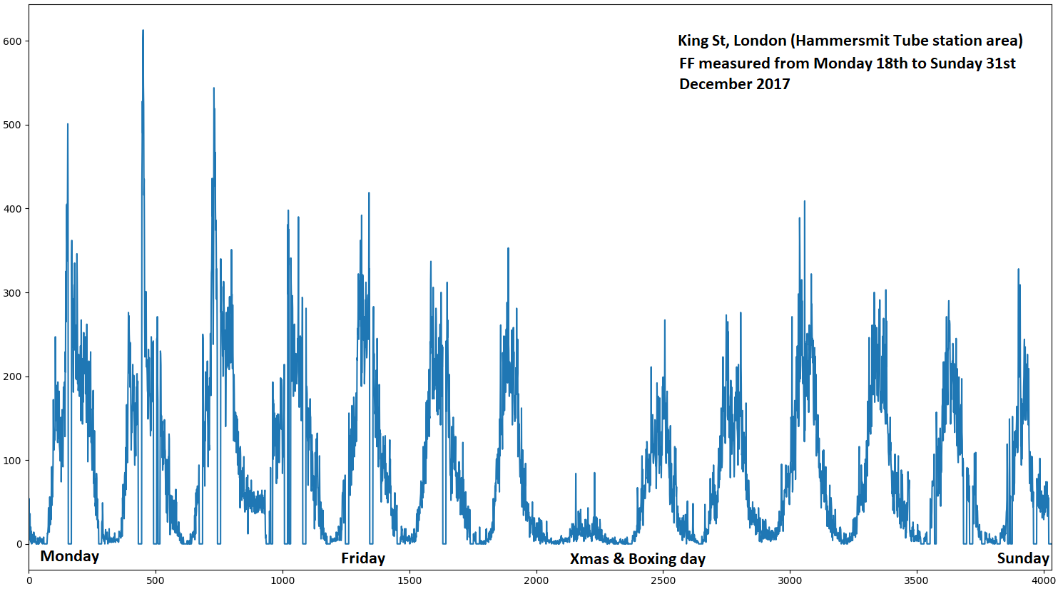
In a single plot, these data tell us about the normal circadian rhythms: each day starts slowly and builds up FF as the hours go by, reaching a peak by the middle of the day and then go down by night time. Although the last week of the year, follows the same shape than the previous one, has less FF and at peak hours and finally, the absence of people in Xmas day, where only two small peaks at some point in the morning and in the afternoon.
We can isolate days and explore in detail what is happening at every single hour, for example, the above location on 24th December (Monday) have this signal:
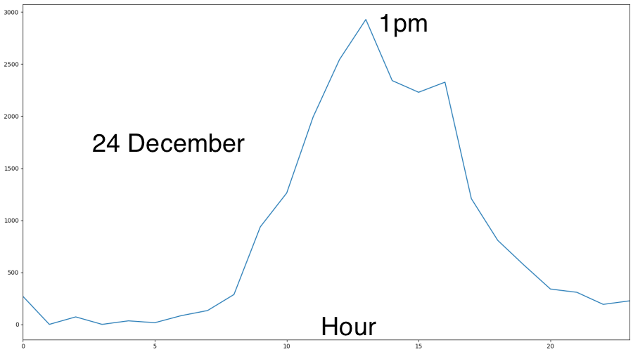
FF didn’t start to pick until 8 am and was at its top from 12 pm to 4 pm. For the 25th of December, we notice substantial differences:
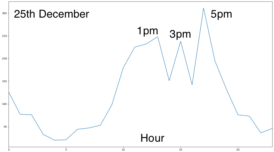
The volume of FF for the peaks is ten times less for the 25th compared with the 24th, and the shape is somehow different at the upper plate. People are letting their houses rather late for a Tuesday. The 5 pm peak is interesting, as we know that shops are closed on Xmas day, and there are no TFL services as well, so, we can speculate that all that ~300 from 4pm-5pm are locals, heading on or coming back Xmas day celebrations.
Another example of how this data can help to identify particular events using the FF signals as a proxy is the Nothing Hill Carnival. In 2017, it happened the 27th and 28th (Monday) of October. Unfourtanaley, there’s no sensor installed around Nothing Hill tube station, but there four around High Street Kensington station, that is a popular point to get to the Carnival.
First, let’s look at the previous Monday, 21st October.
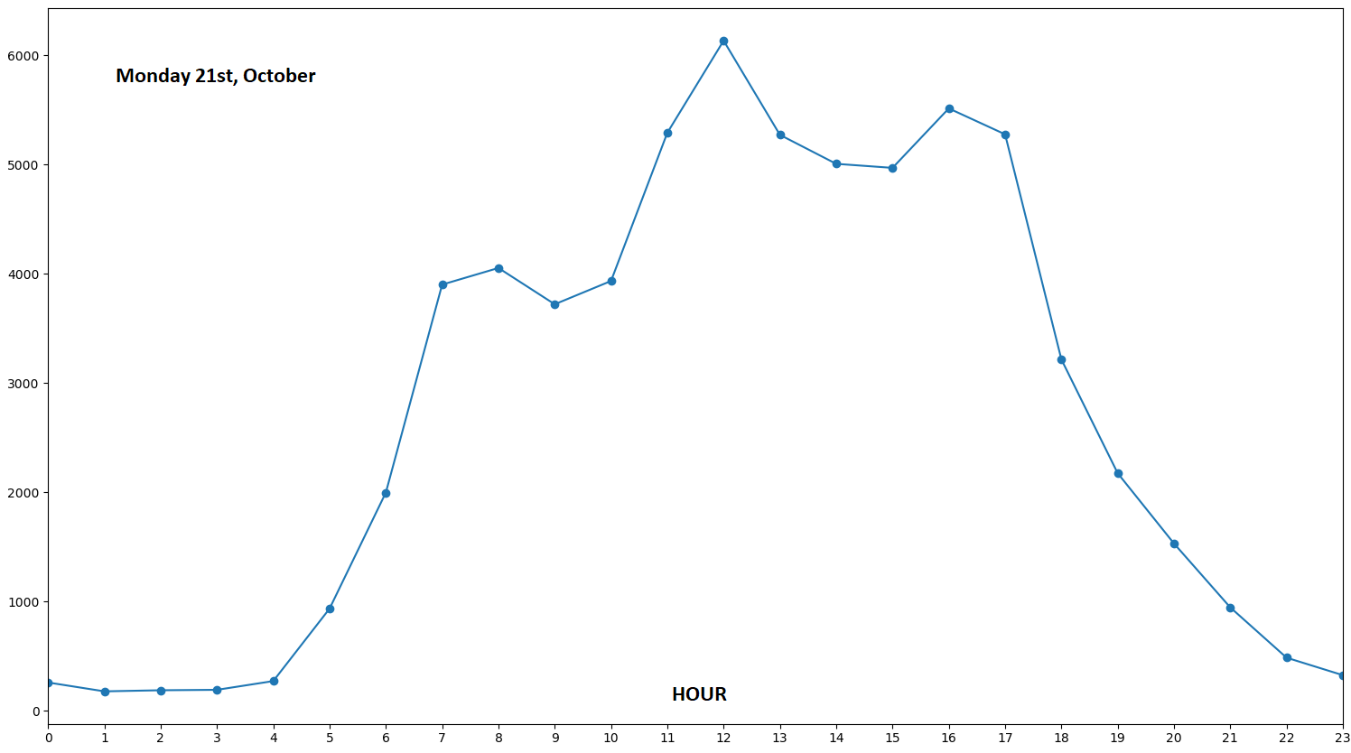
Bussines as usual. Lot’s of people at lunchtime and morning/afternoon peaks. Now, look at the signal for the next Monday (Carnival day).
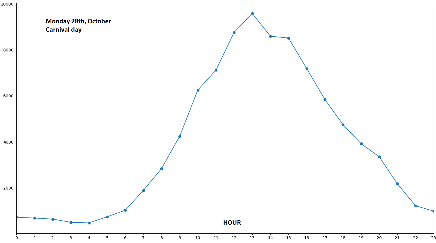
The change in shape is quite dramatic. There’s only one peak at 1 pm and from 9 am to 7 pm, the volume of FF is in orders of more than 4,000 people per hour. Even if without knowing about this Carnival, is clear that something extraordinary happened in this area comparing these two plots
One final example. We can use the FF signal to compare different types of streets in a single shot.
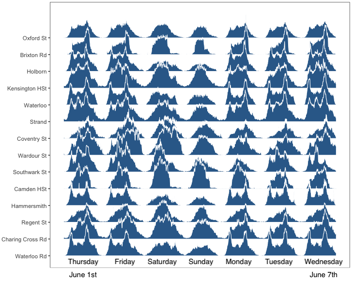
The differences signals tell us the story of each street. Places like Brixton, are mostly nightly places at weekdays (they have a peek at the end of each weekday), but at weekends they are busy most of the day. Au contraire, Holborn, exhibits three clear peaks (morning, lunch, afternoon) during weekdays, but at weekends is kind of dead. Some other places like Camden, have the same signal on Friday, Saturday and Sunday.
In general, we observed that although each signal is unique in shape and range some of them seem more alike, which is as we expected. It’s almost as you can classify in groups many of them. To test these ideas, we cluster all the signals (constructed as the hourly average ) according to shape, using something called Dynamic Time Warping, and we found that basically, they came in four patterns: Three, two or one defined peaks and signals with a long plateau.
Among the different explanations for this behaviour, we test two main ideas: type of location and type of street. In short, we associated the type of pattern with the type of business (coffee, pub, charity shop, . . .) / type of street (pedestrian, motorway, primary, … ). We found that FF signals are more related to the latest that to the type of business. For example, plateaus are highly correlated with pedestrian streets while two and three peaks are correlated with primary and secondary roads.
It seems that type of street has a strong influence on how people are transversing the city, and that FF would be completely different, in shape, between a bakery in Carnaby St and one in Holborn. It is just a different set of crow visiting the location at different hours.
Future and ongoing work
FF signals help to answer questions on Where & When humans move, but not How. For this, we need either peoples’ trajectories (highly invasive) or develop some sort of probabilistic field, based on the volume at location A time t and the volume at location B at time t+1. We are exploring some ideas borrowed from Information Theory and different types of Shannon’s Entropy.
The FF data can be linking with several other sets, like TFL 15min Entrance/Exit Tube data; retail areas classifications, Origin and destiny studies, etc. When all this information is put it together, inform particular locations about their busiest route is possible.
To wrap things up, these data appear to have a tremendous value in recovering the general patterns of human movements and to detect extraordinary events, through monitor changes in the FF signal. The fact that it is non-disclosive and freely available through an agreement with the CDRC is definitely a plus.
[1] Understanding individual human mobility patterns. González M, Hidalgo C, Barabási A. Nature 2008 vol: 453 (7196) pp: 779-782
[2] A tale of many cities: Universal patterns in human urban mobility. Noulas A, Scellato S, Lambiotte R, Pontil M, Mascolo C. PLoS ONE, 2012 vol: 7 (5)
[3] Evidence for a Conserved Quantity in Human Mobility. Alessandretti L, Sapiezynski P, Sekara V, Lehmann S, Baronchelli A. Nature Human Behaviour 2016 vol: 2 (July)

Leave a comment